Enter Tableau!
The ideal tool for precisely this purpose is Tableau - literally a miracle tool for data analysis and data visualization.
As mentioned, data visualization is always a means to an end - a kind of ladder that can be left behind once the goal has been reached.
Below is an example that illustrates the approach to a dataset through visual storytelling.
Chances are, your data looks similar to our sample data. Here is an excerpt from the dataset. It contains, roughly speaking, customer data, order data, shipping data, and payment data.
The Sample Data Set

The sample dataset consists of approximately 190,000 individual data fields. (If interested, you can download the raw data here).
In the examples, we focus on the following aspects and query the data using visual means:
- Sales by product
- Sales by customer
- Customers
- Orders
- Shipping
- Profitability
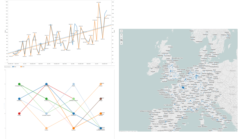
(1) Revenue - viewed by product/product segment
"How has revenue developed for individual product groups?"
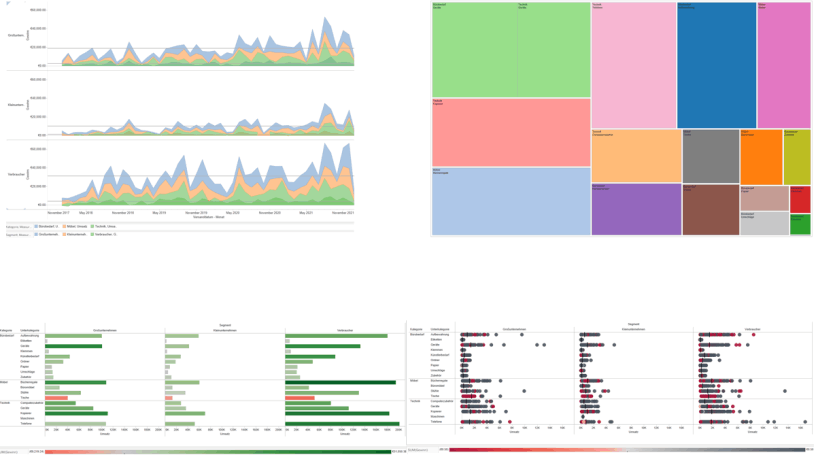
Answers questions such as these:
Which products from the range sell well? How do they compare to other products? Can trends be identified?
(2) Revenue - viewed by customers
"How has revenue developed for individual customer segments?"
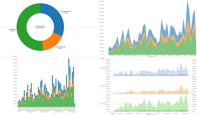
Answers questions such as these:
In addition to general revenue figures by customer segment, the visualization also shows their development over a given reporting period, as well as their geographical distribution, so that local sales promotions or offers, for example, could be considered as measures.
(3) Customers
"Which customers should we pay particular attention to?"
Answers questions such as these:
Which customers generate the highest absolute profit (as opposed to pure revenue) and which ones produce losses? Where are they located geographically?
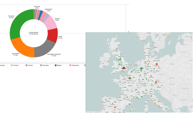
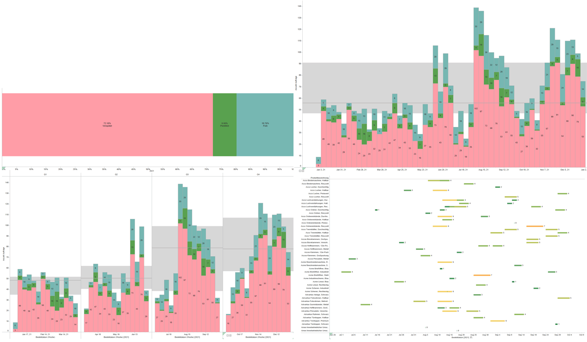
(4) Orders
"How many individual orders were there and where did they come from?"
Answers questions such as these:
Can statements be made about the type, quantity, and development of individual orders, especially regarding their geographic origin?
(5) Shipping
"How punctually did we ship, where were there delays?"
Answers questions such as these:
How many - and specifically which - orders were shipped on time, and how many were late? How much time elapsed between order and actual shipping in each case? Are there differences that can be identified, e.g., by products, product groups, and customer segments?
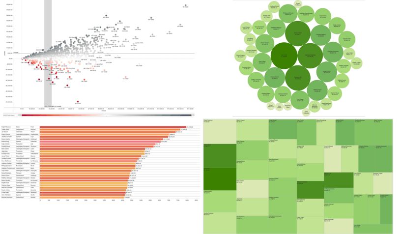
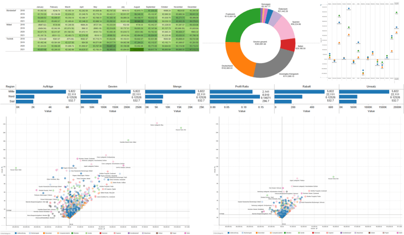
(6) Profitability
"Profitability of individual areas, broken down in detail by product groups and customer segments."
Answers questions such as these:
How profitable are individual areas, broken down by product groups and customer segments ("which products/product groups are most profitable")?
What is the data telling us?
- Revenue by product: We can immediately determine which products in the assortment are selling well, compare them to other products, recognize temporal trends (e.g. seasonal sales increases), measure the success of sales figures directly in connection with discount promotions, and much more.
- Revenue by customer: The visualization shows not only the general revenue figures by customer segment, but also their development over a given reporting period, as well as their geographic distribution, making it possible to consider local sales promotions or offers as a measure.
- Customers: We were interested in which customers generate the highest absolute profit (as opposed to pure revenue), which instead produce losses, and where they are located geographically. In both cases, action is likely required: we should continue to cultivate the "good" customers, for example, with special conditions or offers, while we should seek ways to bring the particularly loss-making customers into the green zone, or possibly separate from them altogether.
- Orders: Statements can also be made about the type, number, and development of individual orders, as well as their geographic origin.
- Shipping: We have enough information to immediately determine the status of our order shipping, i.e. how many - and which - orders were shipped on time and how many were late. It is also possible to determine how much time elapsed between the order and the actual shipment in each individual case and how this differs, for example, according to products, product groups, and customer segments.
- Profitability: Of particular interest is the question of the profitability of individual areas. They can be broken down in detail, for example, by product groups and customer segments ("which products/product groups are the most profitable"). However, the aspect of profitability can also be related to other topics or filtered or further broken down by particularly interesting questions.
Just a reminder: All of this information was extracted from a single spreadsheet, our relatively simple example data set.
Conclusion
Although only a few more or less random questions were selected for our example, the amount of information contained in this simple spreadsheet has proven to be significantly more extensive and informative than initially anticipated.
Thanks to Tableau, the time, technical, and financial effort involved is only a fraction of what would be necessary with "conventional" means - such as Excel formulas, filters, and charts, SQL queries, or custom programming.
And: The type of queries would already have to be specified in detail in advance - i.e. one would basically only find exactly what one has already anticipated, and would thereby lose the chance to discover completely new, previously unsuspected, things in the data and their relationships.
But even more important: The information gained through the various visualizations can now be used profitably. Once the information hidden in the data has been recognized and understood, practical steps can be derived from it and implemented profitably.